
The first two seconds decide everything
When a visitor arrives on a landing page they make three judgements almost instantly: is this for me, can I trust it, and is it going to be worth my time. If all three signals are positive, you have a chance. If any one of them is unclear, you have already lost most of that audience — they bounce, and they bounce with no opportunity for retargeting because session-time was so short the analytics barely fired.
The mistake we see most often is a hero section that tries to be clever. Clever copy fails because clever requires comprehension, and comprehension takes attention you have not yet earned. Clear beats clever every time on a cold landing page. The hero should tell the visitor exactly what the product is, who it's for, and why it's worth their next ten seconds.
The diagnostic we run on every page
Before we touch the design we score the existing page on a fixed checklist. The checklist is boring on purpose — every item is a thing many beautiful pages still get wrong.
Above-the-fold clarity. Can a visitor articulate what the product does after one second of looking? If the headline contains a metaphor, an industry buzzword, or a slogan, the answer is usually no.
Trust signals visible without scrolling. Logos of recognisable customers, a star rating, a usage statistic, a press mention — at least one credibility marker must be in the first viewport. People do not trust an empty page.
One primary action. Many landing pages stack three CTAs in the hero ("Get started", "Book a demo", "Watch the video"). Each one halves the salience of the others. Choose one. The fewer choices, the higher the conversion on the choice that's left.
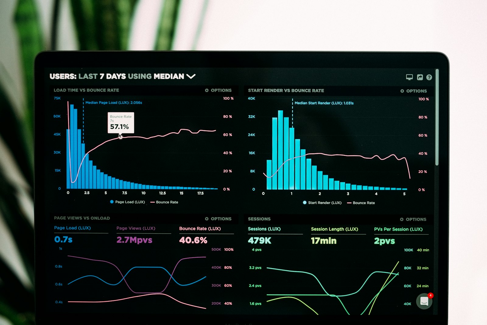
Performance. Largest Contentful Paint under 2.5 seconds, Interaction to Next Paint under 200 ms, Cumulative Layout Shift under 0.1. These are not nice-to-haves — they are search ranking factors and they correlate strongly with conversion. A page that LCPs in five seconds is bleeding visitors before the hero even paints.
Mobile-first reality. Roughly 60% of marketing-site traffic in 2026 is mobile. We design at the 375px width first and scale up — too many teams do the reverse and the mobile experience is an after-thought.
Form friction. Every additional field on a sign-up form drops conversion by a measurable amount. Ask for the absolute minimum, and ask for the rest later in onboarding. Email-only sign-ups outperform email + name + company sign-ups by 20 to 40 percent in our internal data.
Patterns that consistently lift conversion
After scoring the page we apply patterns from a short, opinionated playbook. Not everything below works on every page, but most of these are quietly responsible for double-digit lifts.
Specific outcome headlines. "Save four hours a week on invoicing" beats "Modern accounting for modern teams". Specific outcomes engage system-2 thinking; abstract benefits do not.
Second-person voice. "You" outperforms "we" on conversion-focused copy because it puts the reader in the picture. The page should be a conversation, not a brochure.
Above-the-fold social proof. Move customer logos or a numeric trust signal (e.g., "trusted by 12,000 teams") into the hero. Lower-fold social proof is good; above-the-fold social proof is great.
Sticky CTA on long pages. Marketing pages over 2,000 pixels tall benefit from a sticky CTA that follows the visitor as they scroll. We typically use a small, opacity-90, blurred button that fades in after the user has crossed the first viewport.
Form preview. If your sign-up requires multiple steps, show the visitor the full path before they start ("Step 1 of 3"). People are more willing to start a process whose end they can see.
Loading state design. Pages that stream their hero text and shimmer their hero image while fonts load feel faster than pages that hold a blank screen for the same time. Perceived performance often matters more than measured performance.
What we measure
We instrument every page we ship with three metrics: time-to-first-meaningful-paint, scroll-depth distribution, and CTA click-through. Together they tell us where the page is bleeding attention. If 80% of visitors never reach the second viewport, the hero is broken. If they reach the bottom but don't click, the offer is broken. If they click but don't convert in the next step, the funnel after the page is broken. Each failure is a different bug.
Conversion is not a single number you optimise — it's a chain of small commitments, each of which can fail silently. The goal of a landing page is to make every single step feel low-risk and inevitable. When a page is doing its job, the visitor barely notices they're converting. They just feel like the next click is the obvious one to make.